Project Overview and Context
Previously, Marathon’s website saw low engagement, with only 2,000–5,000 active users annually. This underperformance led to the realization that a modernized, optimized website could attract a larger audience and drive higher sales.
What I Did
01
Re-designed the website to be more user friendly
03
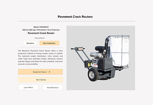
Ensured that the user interface can provide large amounts of detail information for each machine and its model variety without overwhelming the user.
02
Created a user interface that allows consumers easy access to their catalogue of equipment.
Outcome
& Impact
01
The interactive product card that I designed, boosted Marathon’s annual active user base from 2,000–5,000 to over 61,000, significantly expanding their online reach.
02
Improved SEO enhanced organic search rankings across all search engines, attracting major clients like the U.S. military and airport maintenance corporations.
03
Created new business opportunities, allowing Marathon to expand into new ventures and increase profitability.
04
Marathon successfully transitioned contract and seasonal staff into full-time roles, improving retention and preventing the loss of skilled workers.


